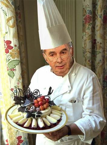
"Why go to all the trouble? Because people eat with their eyes first."
He primarily talks about websites and blogs in his post, but I'm here to tell you that it matters in all realms of writing. The first impression, the format, the cover, the headline, the online design. If that first glance comes across negative in any way, nobody tastes the writing.
I have a friend who struggles with query letters for his literary fiction. I've offered to write them for him, but he doesn't want to impose. He's also insistent that publishers only contract with professors with alphabets strung out behind their names, and his query won't matter. His work is remarkable, but the query process has him stymied. The fact is, a pristine, eye-catching query is like the appetizer that the chef spends time in arranging, drizzling and styling on the plate. If it's good, the diner wants to know what else this chef can cook. I can't get him to understand that dazzling an editor in a query is enough to make him look twice at the writer.
How can you improve your writing presentation, no matter the type of writing?
- Use an original design on your blog or website.
- Use art or photography with your mag features or blog posts.
- Wow a publisher with your voice in your query pitch.
- Compose a headline or title that gives a reader pause.
- Use a sharp hook in the opening sentence of whatever you write.
- Break down chunks of copy into enjoyable, more digestible paragraphs.
- Use visuals that grab, draw a smile, or snap.
- Use promotional material that outshines the competition.
When I realized that my mystery fiction would become a reality, I started thinking visually. I already knew my publisher, Bell Bridge Books, had a creative eye for covers, and they knocked the ball out of the park on Lowcountry Bribe: A Carolina Slade Mystery. But I wanted a website that would wow readers and entice them to stay, read, and ultimately buy. And for the first time in my life, I hired someone to design for me. Visitors adore the site. It's me, and it gives me a serious warm-and-fuzzy feeling. It captures attention.
With a website and book cover from heaven, I designed postcards, business cards, a portable trade-show banner, and labels. Sure, I could print labels at home, but I went to Staples and had them do it on commercial machines so they were polished. I went up a notch to Moo.com for business cards. I used a wedding design from Vistaprint to format the postcards rather than a standard business design.
And everyone is saying, "Wow, love the cover" because of everything they pick up, whether it's a label on an envelope or a postcard in the mail. And most feel good enough about the quality appearance to order the book. Just today, my postmaster saw the labels I put on the promotional packets I mailed to local media, and she asked, "Is this your book?" I assured her it was. "I love the cover," she said. "Is this at Amazon? It looks like something I'd like."
Chefs study for years to design dishes and learn how flavors compliment each other. They understand food far more than we could imagine. But it's amazing how we have to get past the look of the dish first, before we're willing to take a taste.
======
 Available at:
 Amazon
Bell Bridge Books
Barnes & Noble
Come visit Hope's new website -http://www.chopeclark.com - where you'll see the new blog. For a short period of time, these blog posts will be duplicated both here and at www.chopeclark.com, but not for long. Cruise over to www.chopeclark.com and sign up for email updates or RSS feeds, so you won't be left hanging when this blog closes.
4 comments:
This is Good! Thanks Hope! Now Following you on twitter @_aprilinspired.
Hello Hope. I just visited your new site. It looks great!
Your post makes an excellent point too. People do eat with their eyes first - dishes, book covers, headshots, websites, wine labels, shoes, etc.
Plus, I believe by taking pains to keep your book cover, online presence, and other promo materials in "design alignment" with one another, that you are building a recognizable brand for your book (or series).
This is the best writing post I've read since your last great one. I especially liked --Use visuals that grab, draw a smile, or snap.
You got me thinking about that SNAP.
Thank you.
Remember your action verbs!
Post a Comment